Technology marches on, and so has the push toward process color printing. It’s pretty much standard fare these days.
Still, plenty of folks like the richness of Pantone colors, and I’m among them. Ever try building 8 point serif text out of a process mix? Can’t get just the shade you need using the CMYK tables? Then Pantone colors will generally do the trick.
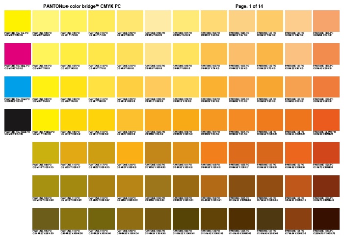
That said, using the standard four inks can at times bring great economy to an otherwise pricey project. For jobs like that, use a color bridge chart color bridge chart to match your color.
It’s not a perfect solution, and in some cases the process equivalent of Pantone ink can look downright nasty. I keep a comparison chart at our front counter, in case you’d like to take a look.